


Soothing tones, joyful hues and various shades of blue are set to colour our 2024, according to the experts.
At a time of uncertainty in many aspects of our life, our need for nurturing and calmness grows, and our desire for a peaceful future dominates. Throughout 2024, our homes will reflect this with shades that are comforting and restorative, yet expressive of our true personalities, and here at Spode we couldn’t be more on board. Read on to discover the key colour trends to embrace this year.
Timeless Blues
Always an interior classic, blue continues to be a treasured shade for 2024, dominating most colour trend forecasts. Linked to tranquillity and wellness, the colour blue helps to create a mindful living environment, while its versatility and eye-catching ability allow us to express ourselves boldly and confidently.
Paint experts Benjamin Moore and Valspar have both chosen blue as their 2024 Colour of the Year. For Benjamin Moore, Blue Nova, a mid-tone blue inspired by the night sky, takes centre stage for the year ahead. Described as having a ‘mystical feel’, this shade of blue is set to bring intrigue and comfort to the home.
For Valspar, a lighter Renew Blue is their Colour of the Year, which aims to inspire people to create a calming space. They describe the shade as being a “nourishing, green-influenced blue that creates a sense of peace wherever you place it.”

Image credit: Valspar

Image credit: Benjamin Moore
Further love of blue can be seen with the latest Pinterest Predicts report, detailing ‘Blue Beauty’ as one of the key trends for next year. The search for ‘blue decor’ has also increased by 14% year on year on Pinterest, while #bluekitchen has over 15 million views on TikTok. So, it is no surprise that colour experts Pantone have included two shades of blue in their S/S24 colour palette - Strong Blue and Horizon Blue.
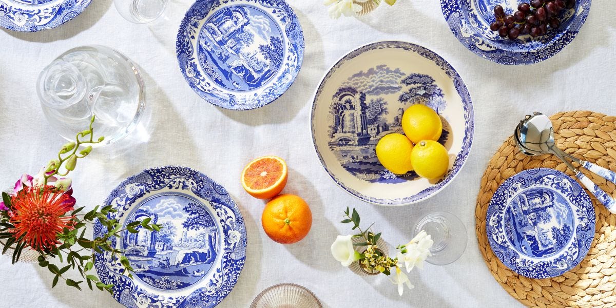
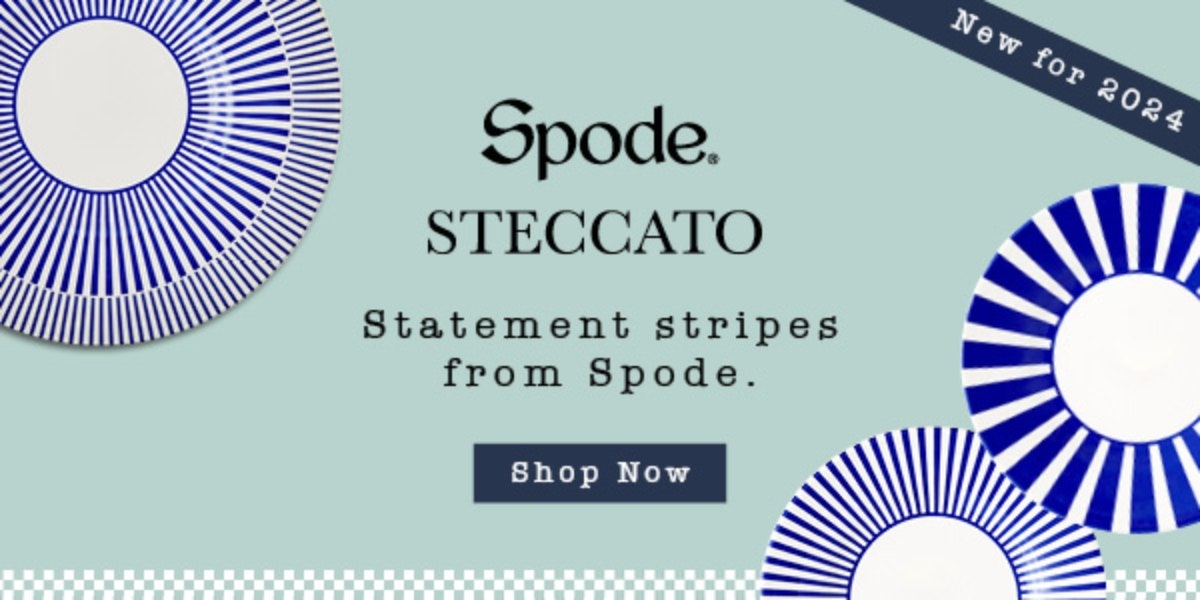
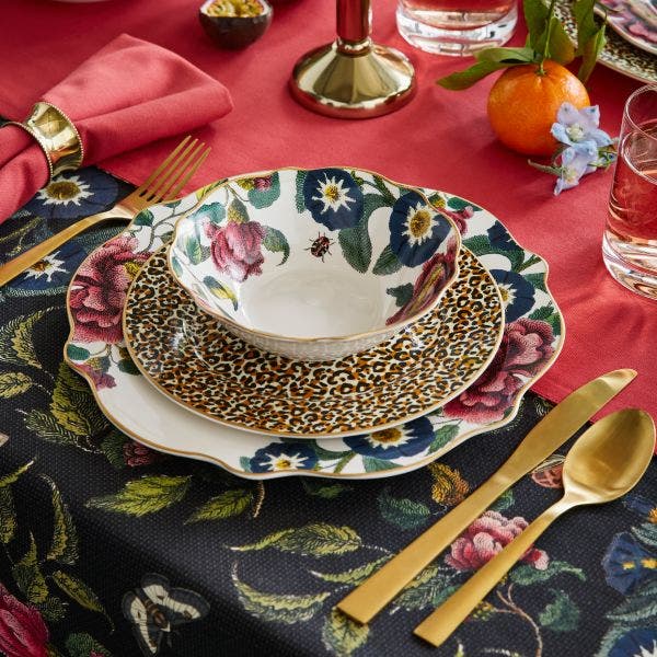
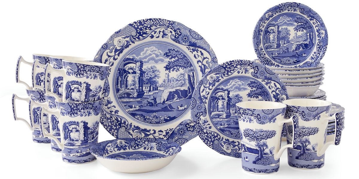
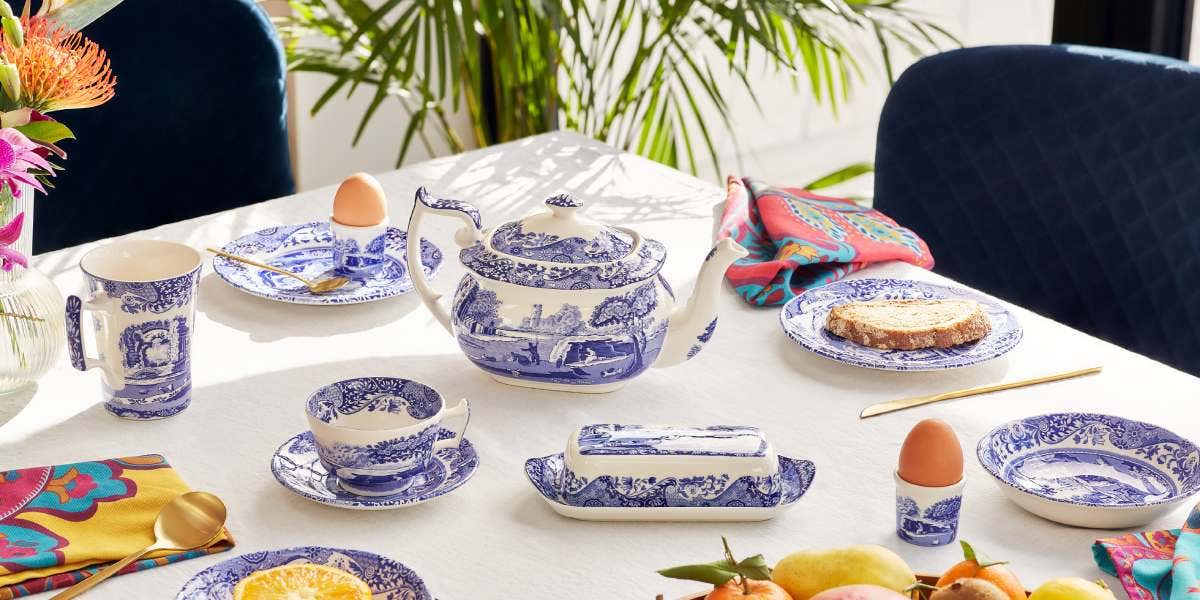
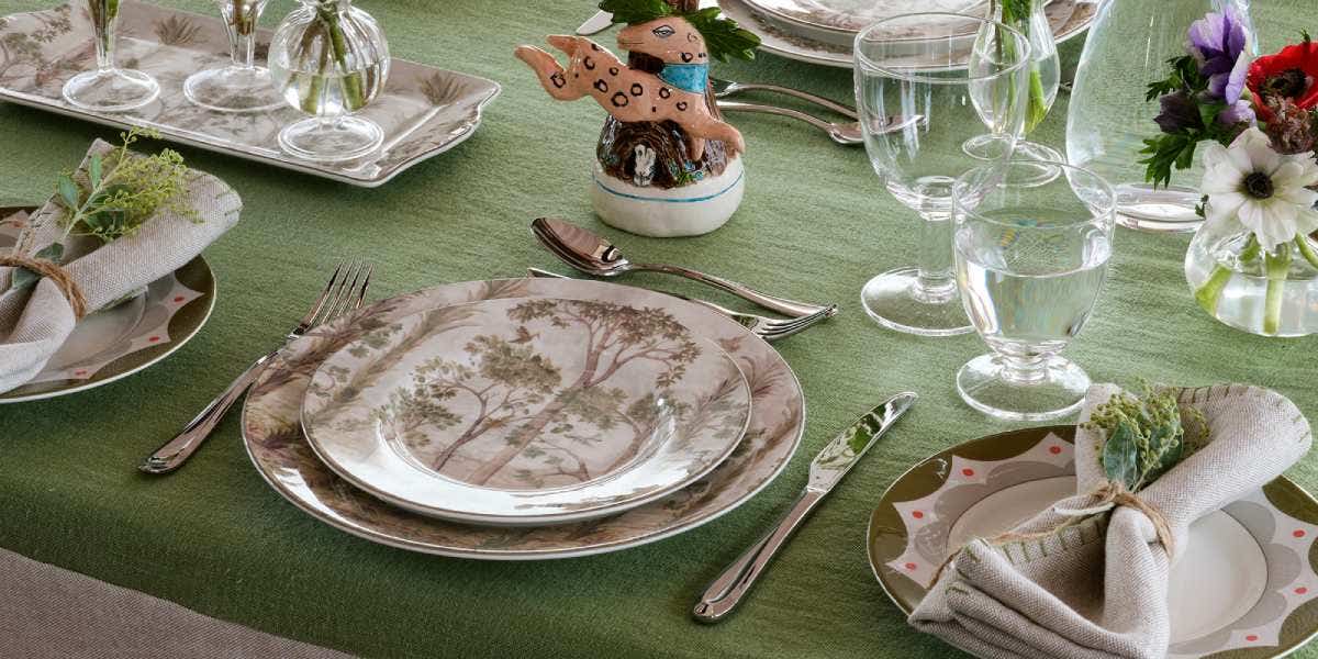
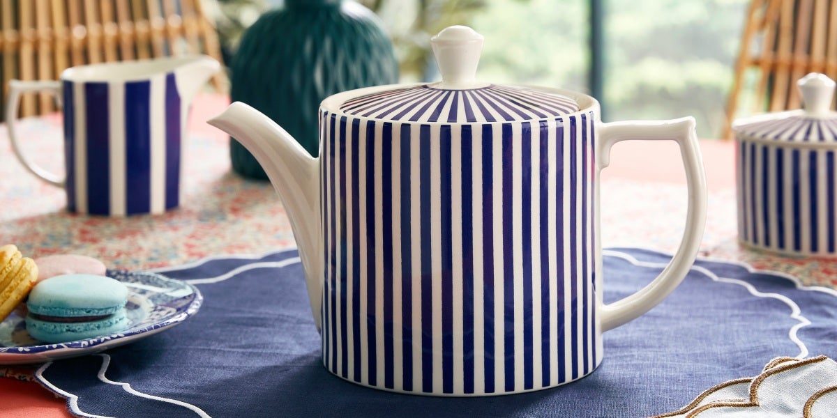
For us here at Spode, blue is a timeless colourway that has a permanent place on our mood board. A striking cobalt blue shade has brought our designs to life for over 200 years, and we continue our love of the versatile colour with a new collection for 2024, launching soon. Steccato pairs the adored shade with a classic design for an effortless way to bring the colourway into your home.

Soothing Shades
Alongside classic blues for 2024 are subtle shades to add warmth and soothing energy, such as paired back oranges, pinks and greens.
Pantone’s Colour of the Year 2024 is the shade Peach Fuzz. It’s described as a “velvety peach tone to enrich the mind, body and soul”. The cosy shade perfectly showcases our desire for togetherness with others, bringing a feeling of kindness, caring and collaboration. To complement, their SS24 palette also showcases Tarragon, a fresh green with yellow undertones. Perfect for adding softness to a room, they are ideal colours for creating your sanctuary.
Similarly, Dulux has chosen their key colour as Sweet Embrace, a soft pink-purple inspired by the theme ‘A place where you belong’. It’s a delicate, optimistic colour taken from the softness of feathers and evening clouds. They also pair this with Pea Shoot, a natural green to bring tranquillity to the home, suggesting it’s the perfect mix for a calm kitchen.
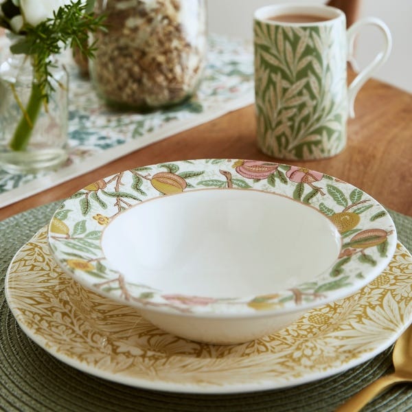
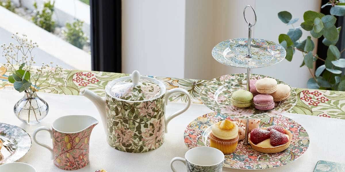
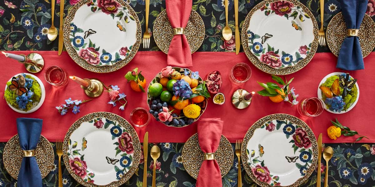
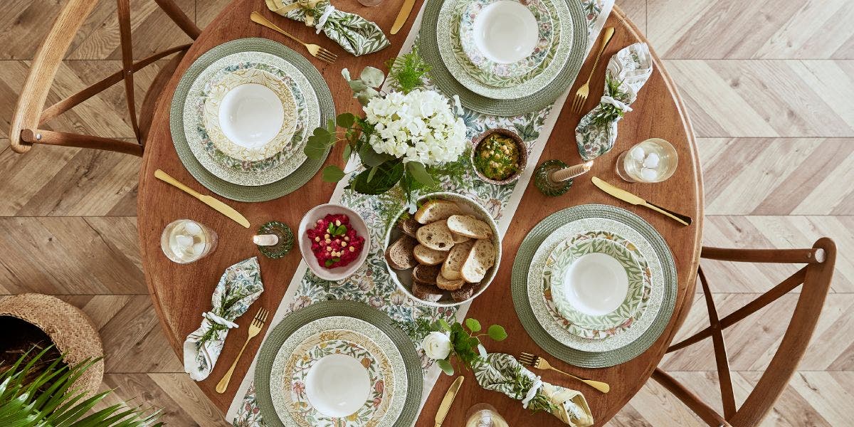
Embrace such calming colours with Spode’s Morris & Co. collection. Pastel shades of pink, green and yellow are showcased in the nature-inspired prints of William Morris to bring pattern and subtle colour to the home. Perfect for spring and summer styling.


Joyful hues
There’s always a place for punchier shades in our colour palette, perfect for adding joy and vibrancy to our homes. For 2024, both colour experts, Pantone and Lick agree with choosing shades that make a statement and boost our mood.
Showing their appreciation for strong colour, Fiesta, a fiery red, makes an appearance on Pantone’s SS24 palette, alongside Sun Orange and Spicy Mustard. Similarly, Lick has chosen a colour palette to simultaneously ground and uplift with energizing reds and zesty oranges – social colours chosen to energise and spark conversation.
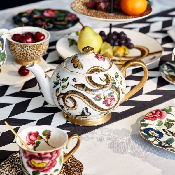
Our Kit Kemp Calypso collection is the ideal tableware to add a pop of colour to your home. Vibrant Pink, yellow and turquoise shades adorn the collection, layering beautifully together to bring joy to every occasion and whisking you away to a tropical island. We couldn’t agree more with designer Kit Kemp, who explains, “No matter what time of year, it is always sunny in our house with this colourful range on the table.”
