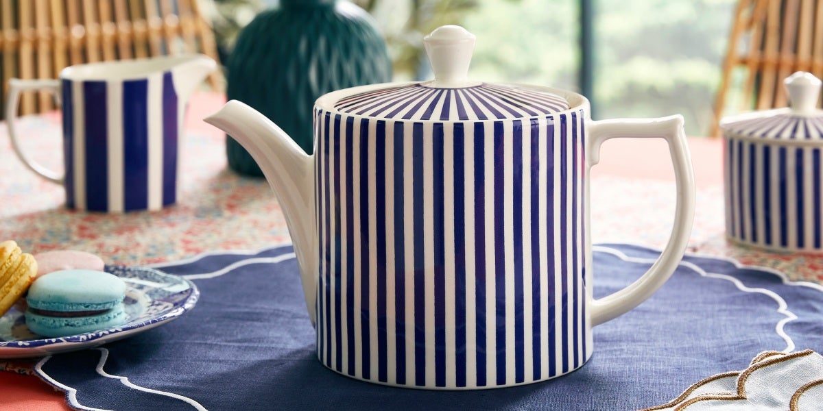
In 1770, in the heart of a thriving industrial Stoke-on-Trent, Josiah Spode I took a mortgage of £500 to open the Spode pottery factory. A decision that was to change the course of British ceramics forever.


The partnership with his son Josiah Spode II was magical and as a result, the Spode business prospered. While elder Josiah was dedicated to developing fine ceramics, his ambitious son was a talented entrepreneur, selling Spode’s wares to the most stylish in their London shop. Although very different, together they critically redefined the pottery industry so much so that British ceramics became revered across the globe.
Join us as we look back through our archives to take a closer look at the heritage designs that have stood the test of time and continue to grace our dinner tables today.
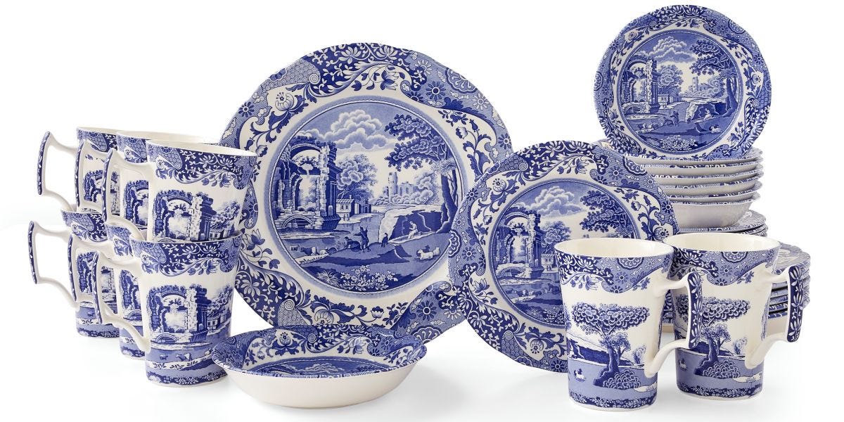
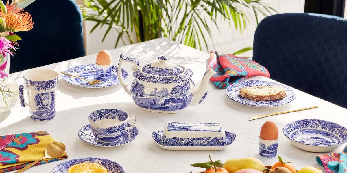
The story of Blue Italian
Quintessentially English and synonymous with Great British design, Spode Blue Italian is now in its 207th year of production. Steeped in mystery, Blue Italian was created in 1816 during the Industrial Revolution, however, its story in fact starts 30 years earlier.
In the late 1700’s, Blue and white ceramics became increasingly popular in Britian, but at the time the market was dominated by Chinese imports. An auction ring, which lowered the profits of Chinese exporters, forced the imports to slow, leaving a void of unresolved demand in its wake. At this time, British pottery factories did not have the capabilities to compete with the quality or price of the blue and white imports, so Josiah Spode set about designing a production method that could replicate the Chinese ware.
Josiah’s inherent innovation and ceramic mastery led him to perfecting the production process of blue and white ware, known as blue under-glaze transfer printing – a redefining moment for Spode and the ceramics industry.


Blue and white designs leapt forth from Spode’s Stoke-on-Trent factory as customers flocked to their London shop eager to have bespoke tableware sets made that featured a particular design or picture they had seen. Josiah II would promptly send the requests to his father to replicate. Of course, this was before any copyright laws and such practices were legal and commonplace.
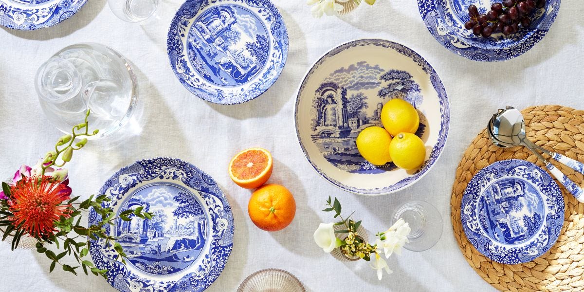
It wasn’t until after Josiah I’s death in 1797 that his son used his father’s technique to create one of the most admired ceramic designs of all time – Blue Italian. At a time when many British nobility and wealthy landed gentry embarked on Grand Tours, Spode found that the trend for oriental designs evolved into a desire for European scenes and landscapes. Shrewdly, Josiah II created a design that was the perfect blend of the two – a charming Italianate scene set within a traditional chinoiserie border.

With impeccable record keeping, Spode’s bank of blue and white patterns can usually be traced to the original artwork or book. Yet, with several theories abound, the provenance of the Blue Italian design cannot be traced with authority. What is known, however, is that Spode has produced hundreds of blue and white designs, but none have captured the hearts of the world in such a powerful way as Blue Italian – a Great British design icon since 1816.
Blue Italian was an instant success when it first launched and continues to be made today over 200 years later just 500 metres from the original Spode factory in the heart of The Potteries.
The story of Zoological Gardens
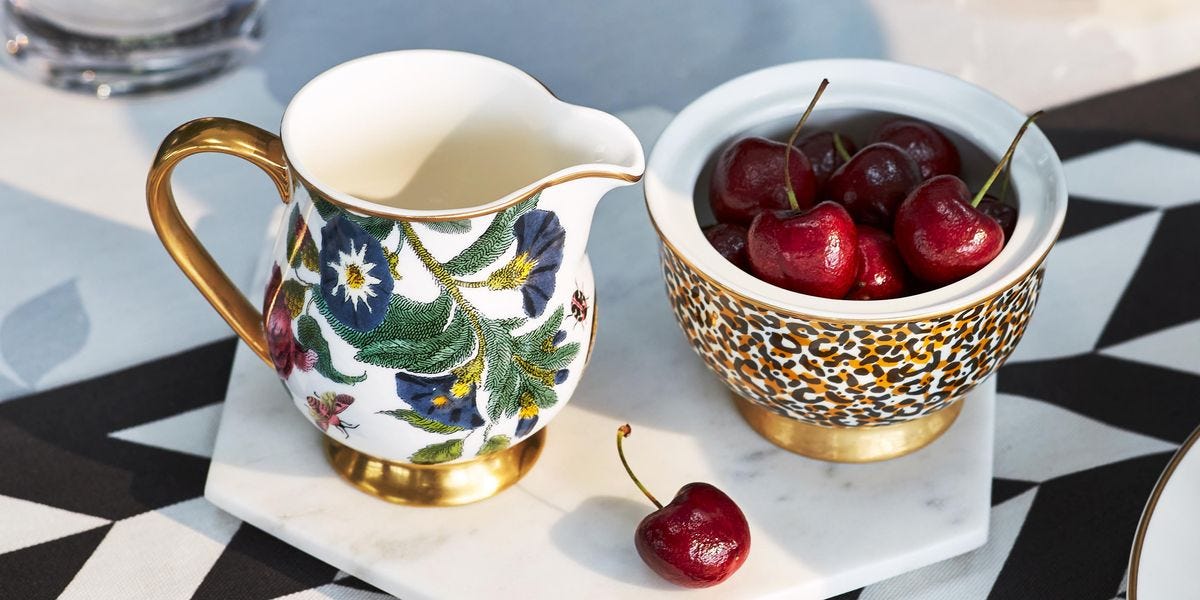
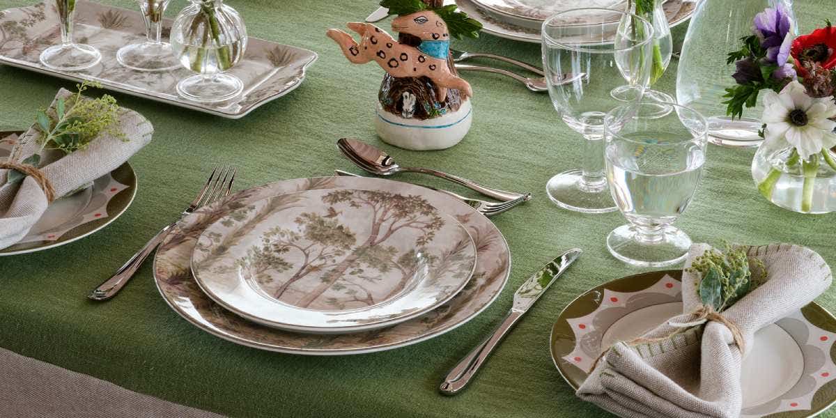
When it came to designing our mix and match Zoological Gardens collection, originally created to celebrate Spode’s 250th anniversary in 2020, we knew we wanted to showcase our heritage and so a deep dive into our vast archive was the source of our inspiration.
After exploring the Spode Museum, which is located at the site of the original Spode factory, three designs caught the eye of Spode designer, Penny. All from the early 19th century, the designs showcased a hint of intrigue and exotic touches and together, Penny envisioned, would make an extraordinary new design worthy of celebrating Spode’s 250-year milestone.

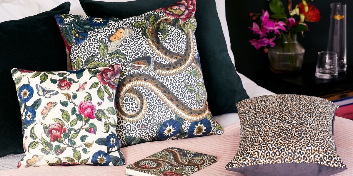
The first print, Zoological, depicted many exotic animals which, at the time of its first design, were not very well known and often regarded as curiosities. The second was a series of patterns called Aesop’s Fable from the 1830s, which were adapted by Spode from illustrations published in the book, Fables of Aesop's. And finally, the third design to inspire was Indian Sporting Scenes, which was designed in the 1810s with illustrations set to stimulate the public’s interest in faraway places.


Each with exotic touches, together the blend of the three designs showcases years of craftsmanship and the perfect amount of intrigue. However, we also decided to reimagine these heritage prints in a mix of pink, turquoise and monochrome shades for an added Spode twist.
The result is an eye-catching collection that oozes style and blends our rich heritage with a maximalist approach.
