


Why we love the colour blue
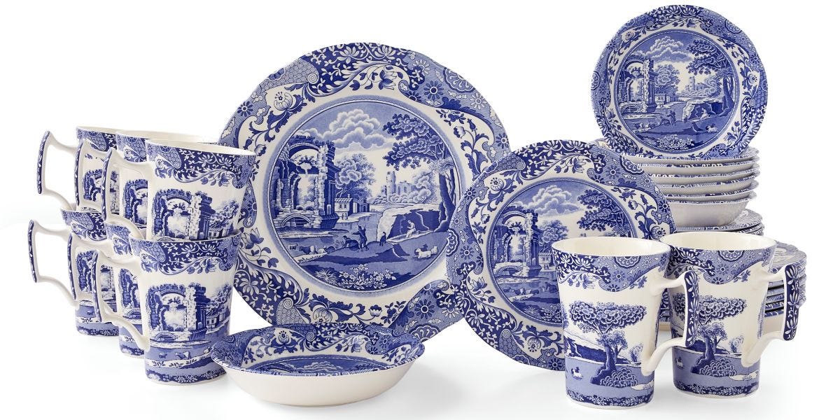
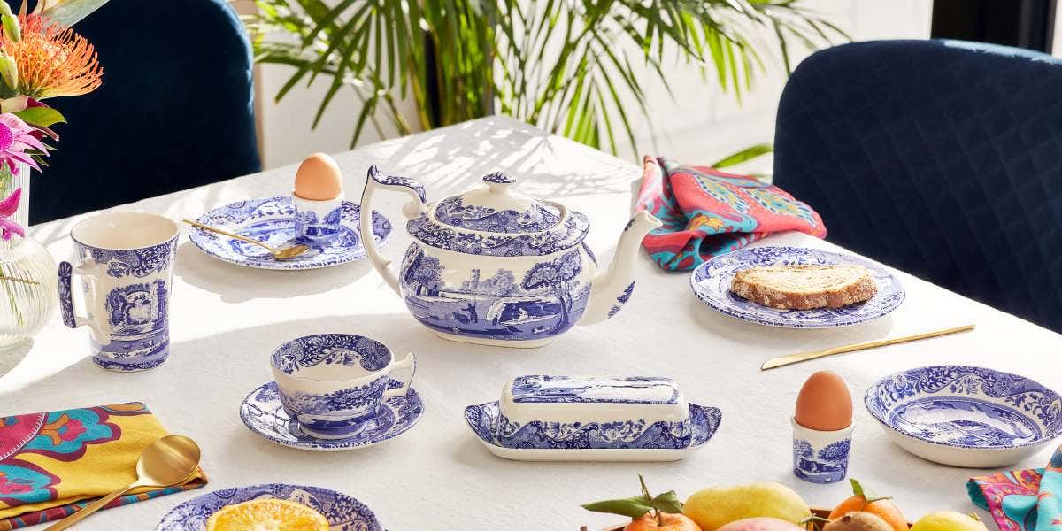
Did you know blue is said to be the world’s favourite colour? And we’re not surprised. As you may have noticed, we have quite the soft spot for it here at Spode. After all it was our founder, Josiah Spode I, who redefined the British pottery industry with his production method for blue and white ceramics and introduced the world to Blue Italian.

The colour blue is now an interior classic, and with its thousands of different tints and shades to explore there’s always something about it to keep us interested. Classic Blue has been a previous Pantone Colour of the Year, being describing as “a timeless and enduring blue hue… elegant in its simplicity.” And 2022 saw Pantone choosing Very Peri as its colour, blending the reliability of blue with the high energy of red to create an empowering shade to encourage creativity. While Dulux opted for Bright Skies, a light, airy and optimistic blue, they claim to be “good for your soul.” Whatever the shade, we just can’t seem to get enough.
What the colour blue symbolises
Blue is a calming colour, evocative of the sea and sky, and one that is often used to create a sense of relaxation and concentration in a room. The colour blue also conjures up feelings of security and confidence, is often seen as a reliable and responsible colour, and represents faith and wisdom.
This multifaceted colour is also said to be one of the most productive colours of the rainbow. Over half of the flags in the world feature the colour blue, it’s the most commonly used colour within business, and across the globe blue jeans are being worn by people every day. Where would we be without it?
How to style blue in the home:
Before opting for the specific shade for your blue décor, think about how you want to feel in a room. Bold, bright blues can lift you up while maintaining a sense of calm, while deeper shades ooze sophistication and make wonderful backdrops for decorative displays.
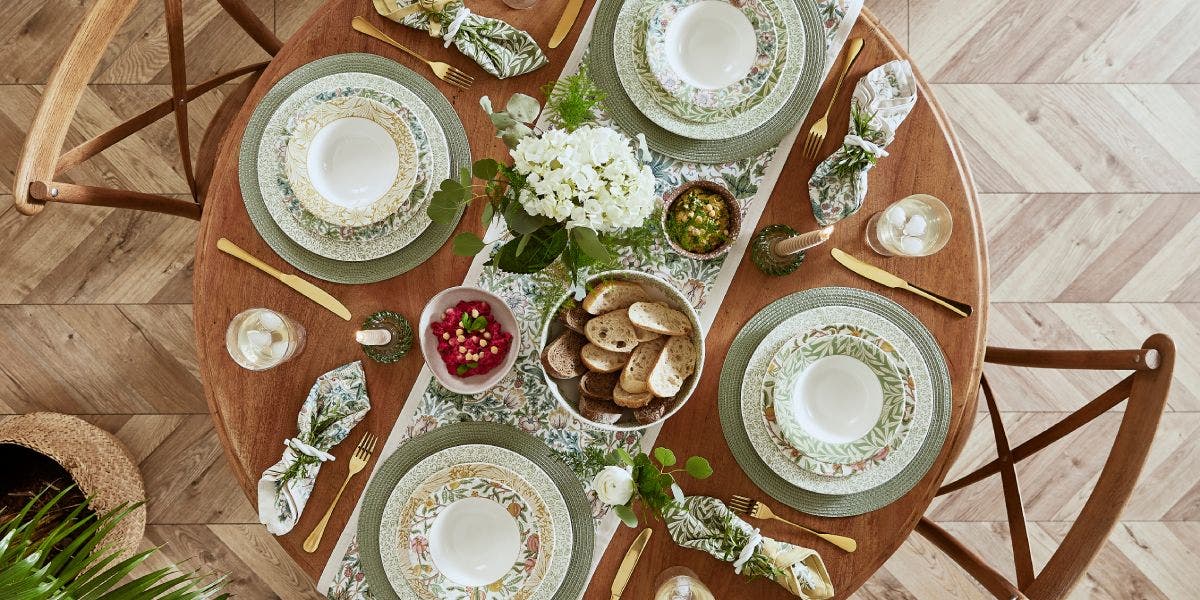
Introducing blue with blocks of colour, either with blue painted walls or with key pieces of furniture, makes an extraordinary statement. And one we adore. But layering different shades and textures can work too, if finding the perfect colour match is proving tricky.
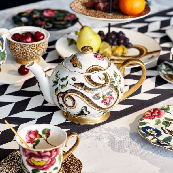
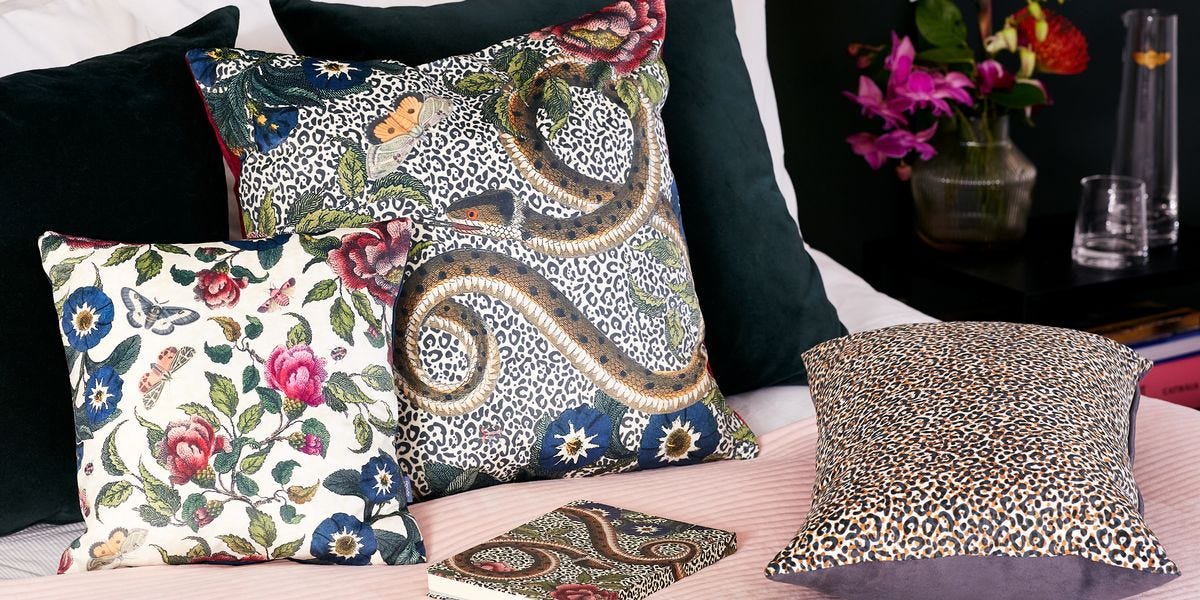
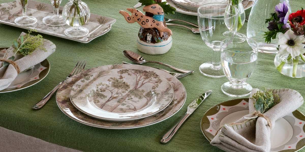
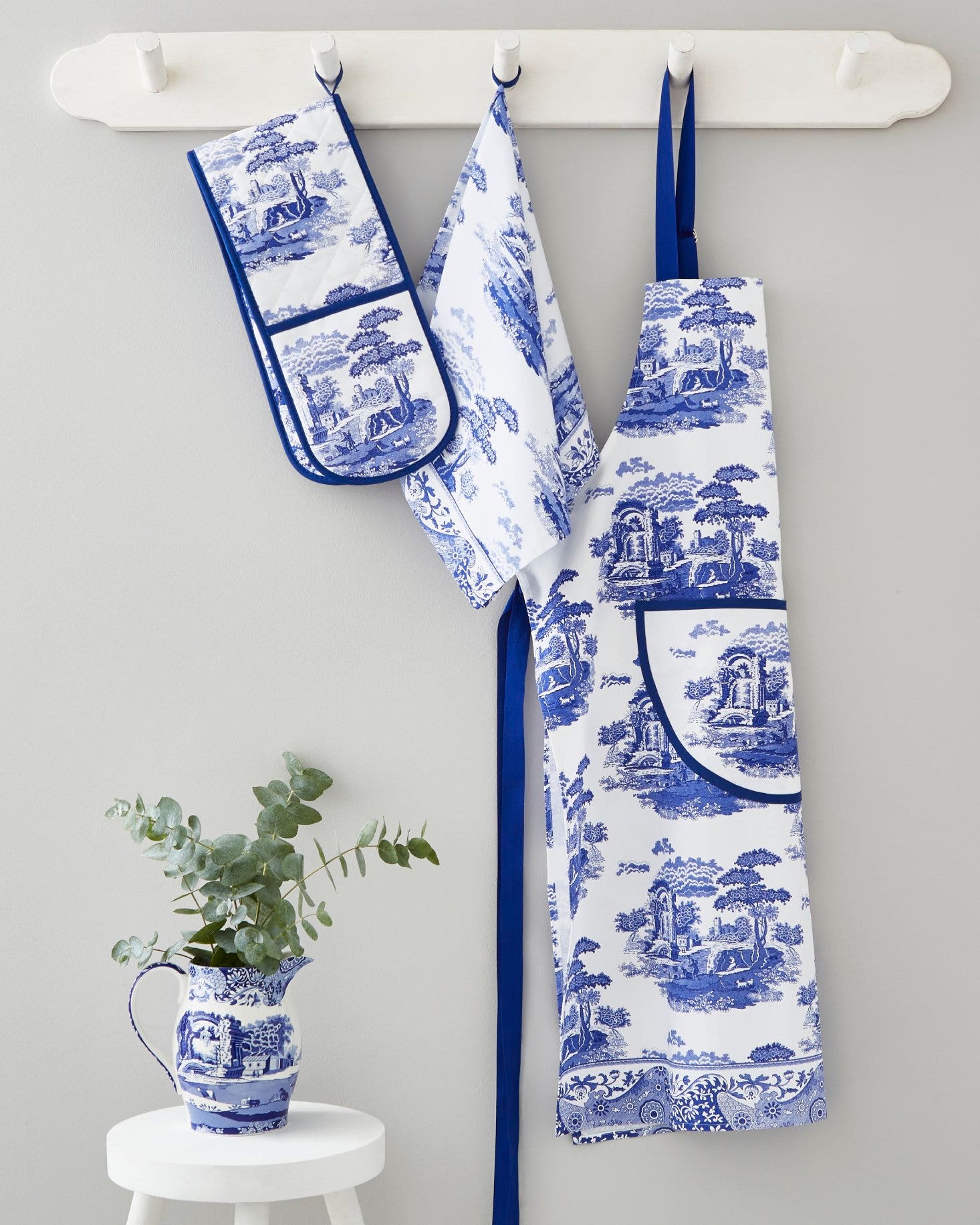
Styling a new colour in your space can be daunting and one you may want to experiment with before completely committing. So instead, give just a gentle nod to your favourite blue tint by adding little splashes to ease you in. Play with pops of blue home accessories with ceramics and textiles for a gentle but satisfying touch.
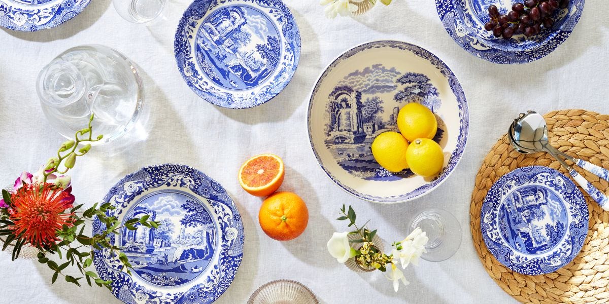
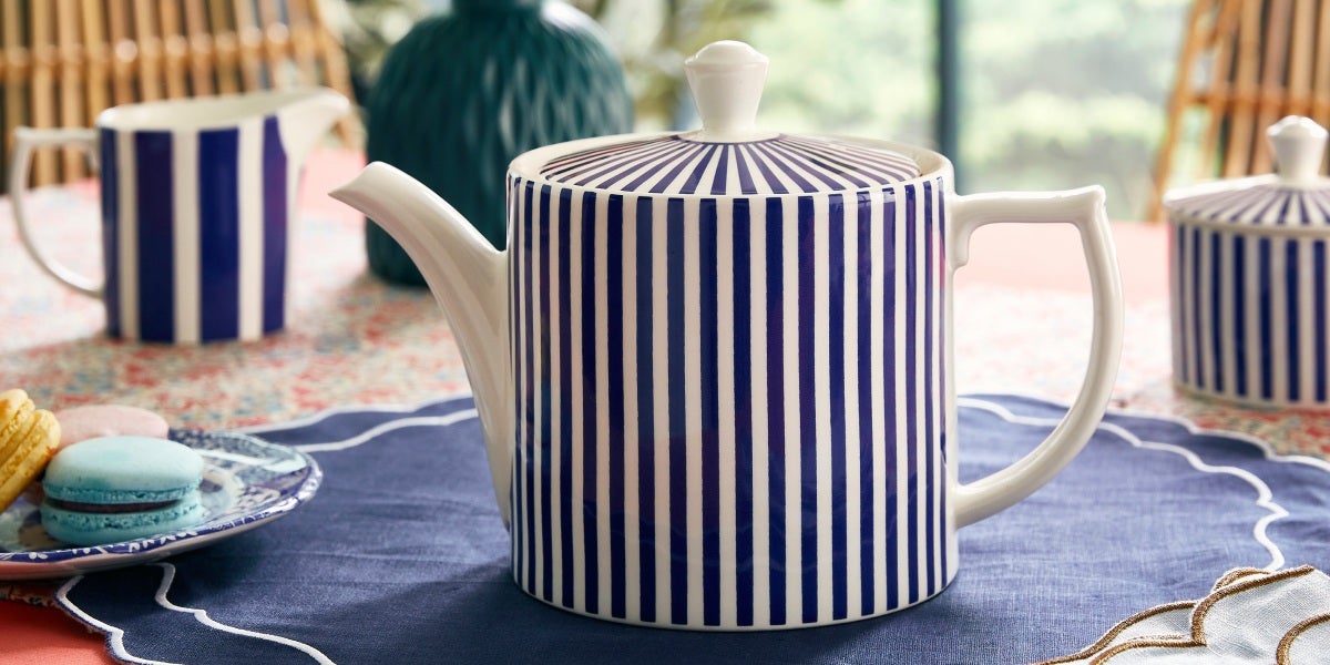
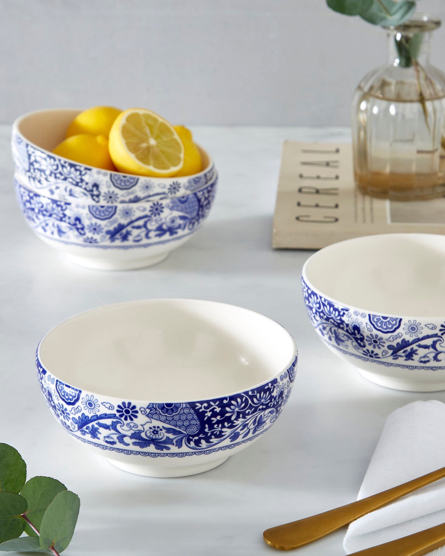
Brocato is the perfect addition for adding a pop of blue into your setting. Inspired by our iconic Blue Italian collection, Brocato offers a fresh take on the heritage design for mix and match styling. The collection of plates and bowls features the finely detailed Imari oriental border re-imagined in lighter shades of cobalt blue, wrapped around each piece and set against a clean, white background to allow the striking shade of blue to stand bold on your table.

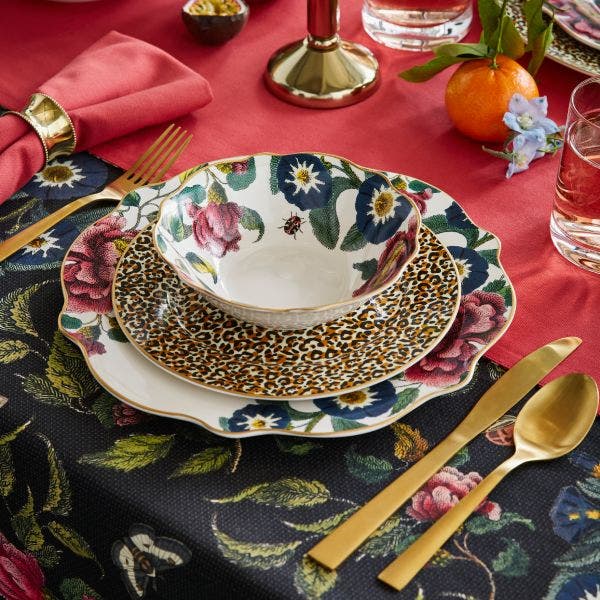
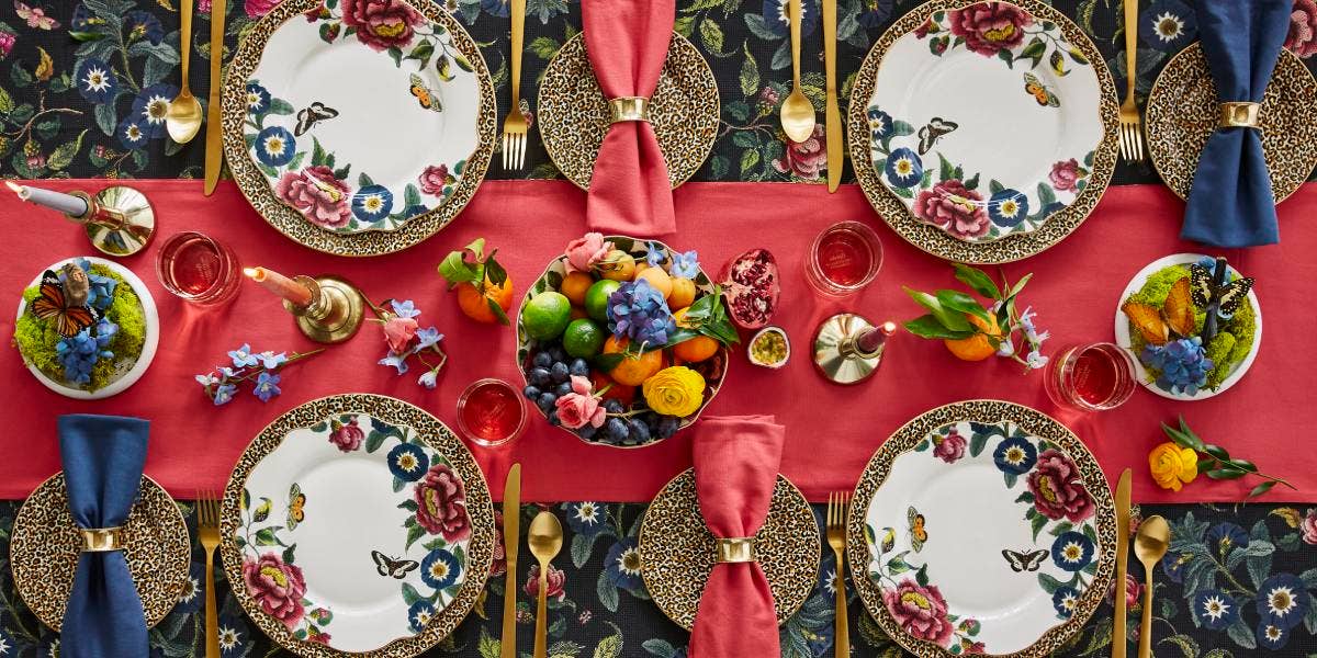
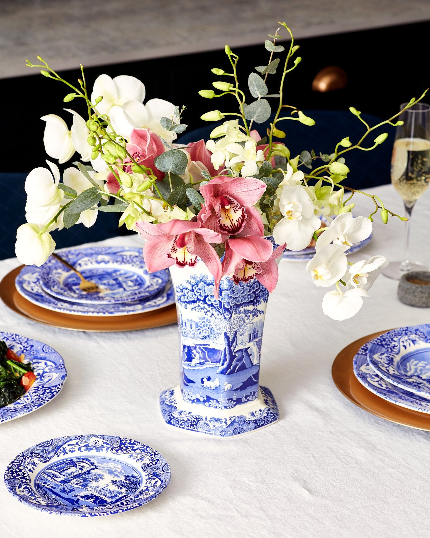
Not brave enough to dedicate a whole space or setting to the colour blue? Try pairing it with other colours to achieve the right balance for you. Grey and blue living rooms are a popular choice, and we find blue looks particularly extraordinary alongside pinks, oranges, and yellows.
Love the colour blue just as much as us? Follow us on social media to get more style inspiration. We’d also love to see how you style blue in your home, tag us in your posts @by_spode.